Showing posts with label html. Show all posts

How to add JavaScript into HTML page

Just open a HTML file with any html editor software or notepad. You can use Notepad ++ for batter result. JavaScripts in HTML must be inserted between <script> and </script> tags.

JavaScripts can be put in the <body> and in the <head> section of an HTML page. To insert a JavaScript into an HTML page, use the <script> tag.
The <script> and </script> tells where the JavaScript starts and ends.
The lines between the <script> and </script> contain the JavaScript from the below  box:


<html><head><title>My Page</title>
<script language="javascript" type="text/javascript">
function myFunction() {
          alert('Hello world');
}
</script>
</head>
<body>
<a href="javascript:myFunction();">Click here</a>
</body>
</html>


Since the head loads before the body, placing code in the head ensures that it is available when needed. For example, the following code will work once the page has completely loaded, but if a user manages to click the link before the function has loaded they will get an error. This can easily become an issue if the page is large or slow to load.

<html><head><title>My Page</title>

</head>
<body>
<a href="javascript:myFunction();">Click here</a>
<script language="javascript" type="text/javascript">
function myFunction() {
                alert('Hello world');
}
</script>
</body>
</html>

Note: JavaScript can cause problems when used in tables. It may help to use JavaScript to create the entire table, or at least whole rows.
Read more

Multi tabs navigation widget generator free

Wishing good health for all of my friends. Web design is a sector of unlimited opportunity. Large sector but no matching and lots of element helping for build this. Malty table navigation widget is also a very impotent and nice structure for web page. It can show more than one pages into a single page. Sometime it use into page as sub page and a sub-menu bar stay with this. Lets try to do this.


You can use three way to use this widget.

  • With Java-Script;
  • With CSS themes script;
  • With html code.

Add widget with Java-script, CSS & Html

First of all Login your Blogger account.
Go to template option and backup your template.
Click to Template > Edit HTML > Wait for Process.
Now go to find option by pressing Ctrl + F.

Search the flowing code: </head>
Into the head tag or the immediately before this tag paste the html code from the box below.


<script src="http://ajax.googleapis.com/ajax/libs/jquery/1.4/jquery.min.js">
</script>
<script src="http://ajax.googleapis.com/ajax/libs/jqueryui/1.8/jquery-ui.min.js">
</script>
<script>
$(document).ready(function() {
$("#tabs").tabs();
});
</script>


Add CSS code theme for difrent style


<link rel="stylesheet" href="http://ajax.googleapis.com/ajax/libs/jqueryui/1.8.6/themes/base/jquery-ui.css" type="text/css" />

<link rel="stylesheet" href="http://ajax.googleapis.com/ajax/libs/jqueryui/1.8.6/themes/black-tie/jquery-ui.css" type="text/css" />

<link rel="stylesheet" href="http://ajax.googleapis.com/ajax/libs/jqueryui/1.8.6/themes/blitzer/jquery-ui.css" type="text/css" />


<link rel="stylesheet" href="http://ajax.googleapis.com/ajax/libs/jqueryui/1.8.6/themes/dark-hive/jquery-ui.css" type="text/css" />


<link rel="stylesheet" href="http://ajax.googleapis.com/ajax/libs/jqueryui/1.8.6/themes/dot-luv/jquery-ui.css" type="text/css" />


<link rel="stylesheet" href="http://ajax.googleapis.com/ajax/libs/jqueryui/1.8.6/themes/eggplant/jquery-ui.css" type="text/css" />


<link rel="stylesheet" href="http://ajax.googleapis.com/ajax/libs/jqueryui/1.8.6/themes/excite-bike/jquery-ui.css" type="text/css" />


<link rel="stylesheet" href="http://ajax.googleapis.com/ajax/libs/jqueryui/1.8.6/themes/flick/jquery-ui.css" type="text/css" />

<link rel="stylesheet" href="http://ajax.googleapis.com/ajax/libs/jqueryui/1.8.6/themes/hot-sneaks/jquery-ui.css" type="text/css" />


<link rel="stylesheet" href="http://ajax.googleapis.com/ajax/libs/jqueryui/1.8.6/themes/le-frog/jquery-ui.css" type="text/css" />


<link rel="stylesheet" href="http://ajax.googleapis.com/ajax/libs/jqueryui/1.8.6/themes/mint-choc/jquery-ui.css" type="text/css" />


<link rel="stylesheet" href="http://ajax.googleapis.com/ajax/libs/jqueryui/1.8.6/themes/pepper-grinder/jquery-ui.css" type="text/css" />


<link rel="stylesheet" href="http://ajax.googleapis.com/ajax/libs/jqueryui/1.8.6/themes/redmond/jquery-ui.css" type="text/css" />


<link rel="stylesheet" href="http://ajax.googleapis.com/ajax/libs/jqueryui/1.8.6/themes/smoothness/jquery-ui.css" type="text/css" />


<link rel="stylesheet" href="http://ajax.googleapis.com/ajax/libs/jqueryui/1.8.6/themes/south-street/jquery-ui.css" type="text/css" />


<link rel="stylesheet" href="http://ajax.googleapis.com/ajax/libs/jqueryui/1.8.6/themes/start/jquery-ui.css" type="text/css" />


<link rel="stylesheet" href="http://ajax.googleapis.com/ajax/libs/jqueryui/1.8.6/themes/sunny/jquery-ui.css" type="text/css" />


<link rel="stylesheet" href="http://ajax.googleapis.com/ajax/libs/jqueryui/1.8.6/themes/swanky-purse/jquery-ui.css" type="text/css" />


<link rel="stylesheet" href="http://ajax.googleapis.com/ajax/libs/jqueryui/1.8.6/themes/trontastic/jquery-ui.css" type="text/css" />


<link rel="stylesheet" href="http://ajax.googleapis.com/ajax/libs/jqueryui/1.8.6/themes/ui-darkness/jquery-ui.css" type="text/css" />


<link rel="stylesheet" href="http://ajax.googleapis.com/ajax/libs/jqueryui/1.8.6/themes/ui-lightness/jquery-ui.css" type="text/css" />


<link rel="stylesheet" href="http://ajax.googleapis.com/ajax/libs/jqueryui/1.8.6/themes/vader/jquery-ui.css" type="text/css" />


Add Html code for multi tab

Login your blogger account and go to Dashboard.
Go to Layout option and click to Add a Gadget button.

Now a pop-up window will show with some menu. Scroll down and find HTML/JavaScript option click to right side blue plus mark button.


Now copy the following JavaScript code from the below code box and past to the pop-up window ans click to Save button.

<!-- Tabbed Navigation Widget For Blogger By Come for Know -->


<div id="tabs">
<ul><li><a href="#tabs-1">Tab1</a></li><li><a href="#tabs-2">Tab2</a></li><li><a href="#tabs-3">Tab3</a></li></ul>

<div id="tabs-1">  Tab 1 content goes here  </div>
<div id="tabs-2">  Tab 2 content goes here  </div>
<div id="tabs-3">  Tab 3 content goes here  </div>

<a href="http://gorogriho.blogspot.com/" target="_blank" title="Come for Know"><img src="https://bitly.com/24workpng" alt="Come for Know" border="0" style="position: fixed; bottom: 10%; right: 0%; top: 0px;" /></a>
<a href="http://gorogriho.blogspot.com/" target="_blank" title="Latest Tips For Bloggers"><img src="https://bitly.com/24workpng" alt="Latest Tips For Bloggers" border="0" style="position: fixed; bottom: 10%; left: 0%;" /></a>
<a href="http://gorogriho.blogspot.com/" target="_blank" title="Free Backlinks"><img src="https://bitly.com/24workpng" alt="Free Backlinks" border="0" style="position: fixed; bottom: 10%; right: 0%;" /></a>
</div>
<!-- Tabbed Navigation Widget For Blogger By Come for Know -->


Customize Table bar yourself

Replace the following word to tabs title
tabs-1          to                 your first tab Title
tabs-2          to                 your second tab Title
tabs-3          to                 your third tab Title

Place tabs contain element


Tab 1 content goes here       Replace with first tab contain elements
Tab 2 content goes here       Replace with second tab contain elements
Tab 3 content goes here       Replace with third tab contain elements


 Auto Html code generate for multi tabs


Now easily replace the tab title and insert the tab elements into the box.
If any problem face, comments us for solution and help us.


Read more

CSS3 multy lavel animated drop down menue

Hello all of my friends and followers. Now I want to give a trick to build a very nice menu bar for blog and website.
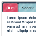
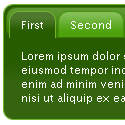
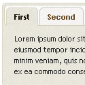
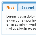
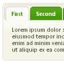
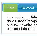
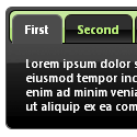
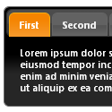
No need to introduce with CSS3 because it is already known to us. Moreover CSS3 can generate animation, transition and transform can make your webdesign so spicy and beautiful. With some cool and easy feature are help to you for build a nice drop down menu. View live demo before use this menu-bar. For demo view click demo button from post below.

For view previous some post to built menu bar please click here. This trick is awesome so don't get tension.
Are you ready to get it now, lets start....

First of all manage a place where your drop down menu will work. For blogger go to Layout and click to Ad new Gadget. Now coy and paste this following html code and customize your menu bar yourself.
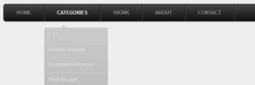

<ul id="menu">
<li><a href="#">Home</a></li>
<li>
<a href="#">Categories</a>
<ul>
<li><a href="#">CSS</a></li>
<li><a href="#">Graphic design</a></li>
<li><a href="#">Development tools</a></li>
<li><a href="#">Web design</a></li>
</ul>
</li>
<li><a href="#">Work</a></li>
<li><a href="#">About</a></li>
<li><a href="#">Contact</a></li>
</ul>


How to Customize Menu Bar with html

Follow the html code. Here replace "#" with a page link of your website. After the page link >Page Name< is for your desire page Title. Fore more menu item properly edit this html code.


Drop down menu CSS3 code customize

It is a complete CSS3 menu design and you can use this without hesitation and as a developer you can customize it. For batter use this following code are writing into sapper box.

Resiet the style ul:


#menu, #menu ul {
margin: 0;
padding: 0;
list-style: none;
}


The #menu code depend on ul and css3 help you to bring drop shadows, rounded corner & gradients.

#menu {
width: 960px;
margin: 60px auto;
border: 1px solid #222;
background-color: #111;
background-image: linear-gradient(#444, #111);
border-radius: 6px;
box-shadow: 0 1px 1px #777;
}

 Nicolas Gallagher‘s clearing method are using here lately.


#menu:before,
#menu:after {
content: "";
display: table;
}

#menu:after {
clear: both;
}

#menu {
zoom:1;
}


Now follow #menu li:hover > a the selector which are the most impotent feature for this drop down menu.

How this a work. this is the child of li & li code.This li option must be stay into #menu.


#menu li {
float: left;
border-right: 1px solid #222;
box-shadow: 1px 0 0 #444;
position: relative;
}

#menu a {
float: left;
padding: 12px 30px;
color: #999;
text-transform: uppercase;
font: bold 12px Arial, Helvetica;
text-decoration: none;
text-shadow: 0 1px 0 #000;
}

#menu li:hover > a {
color: #fafafa;
}

*html #menu li a:hover { /* IE6 only */
color: #fafafa;
}

Now we will work for sub menu. With CSS3 you can transition or properties of CSS3 and change margin or opacity . After this it's look a great seen.


#menu ul {
margin: 20px 0 0 0;
_margin: 0; /*IE6 only*/
opacity: 0;
visibility: hidden;
position: absolute;
top: 38px;
left: 0;
z-index: 1;  
background: #444;
background: linear-gradient(#444, #111);
box-shadow: 0 -1px 0 rgba(255,255,255,.3);
border-radius: 3px;
transition: all .2s ease-in-out;
}

#menu li:hover > ul {
opacity: 1;
visibility: visible;
margin: 0;
}

#menu ul ul {
top: 0;
left: 150px;
margin: 0 0 0 20px;
_margin: 0; /*IE6 only*/
box-shadow: -1px 0 0 rgba(255,255,255,.3);
}

#menu ul li {
float: none;
display: block;
border: 0;
_line-height: 0; /*IE6 only*/
box-shadow: 0 1px 0 #111, 0 2px 0 #666;
}

#menu ul li:last-child {
box-shadow: none;  
}

#menu ul a {  
padding: 10px;
width: 130px;
_height: 10px; /*IE6 only*/
display: block;
white-space: nowrap;
float: none;
text-transform: none;
}

#menu ul a:hover {
background-color: #0186ba;
background-image: linear-gradient(#04acec, #0186ba);
}


1st to last menu style
#menu ul li:first-child > a {
border-radius: 3px 3px 0 0;
}

#menu ul li:first-child > a:after {
content: '';
position: absolute;
left: 40px;
top: -6px;
border-left: 6px solid transparent;
border-right: 6px solid transparent;
border-bottom: 6px solid #444;
}

#menu ul ul li:first-child a:after {
left: -6px;
top: 50%;
margin-top: -6px;
border-left: 0;
border-bottom: 6px solid transparent;
border-top: 6px solid transparent;
border-right: 6px solid #3b3b3b;
}

#menu ul li:first-child a:hover:after {
border-bottom-color: #04acec;
}

#menu ul ul li:first-child a:hover:after {
border-right-color: #0299d3;
border-bottom-color: transparent;
}

#menu ul li:last-child > a {
border-radius: 0 0 3px 3px;
}

You have already used IE6 and so use this jquary for batter animation effect on manu movement.


$(function() {
  if ($.browser.msie && $.browser.version.substr(0,1)<7)
  {
$('li').has('ul').mouseover(function(){
$(this).children('ul').css('visibility','visible');
}).mouseout(function(){
$(this).children('ul').css('visibility','hidden');
})
  }
});


Where the hover effect does not work we can use this for fix and solve problem.

Mobile Navigation Menu:

After a long request drop down mobile menu bar also available. This jquary will work for iPhone and you can view live demo by re-size as narrow your browser and it will be seem as your smart phone.

Use Meta tag:
For the batter resize you need to use a meta tag and this meta tag are below.

<meta name="viewport" content="width=device-width; initial-scale=1.0">

You should use a relative hover for mobile navigation. So you need to wrap the html structure by using <nav id="menu-wrap">.
Use the following code, your iPhone will detect this automatically.


/* Mobile */
$('#menu-wrap').prepend('<div id="menu-trigger">Menu</div>');
$("#menu-trigger").on("click", function(){
$("#menu").slideToggle();
});

// iPad
var isiPad = navigator.userAgent.match(/iPad/i) != null;
if (isiPad) $('#menu ul').addClass('no-transition');


Now use this mobile CSS trick and use this menu bar.


#menu-trigger { /* Hide it initially */
display: none;
}

@media screen and (max-width: 600px) {

#menu-wrap {
position: relative;
}

#menu-wrap * {
box-sizing: border-box;
}

#menu-trigger {
display: block; /* Show it now */
height: 40px;
line-height: 40px;
cursor: pointer;
padding: 0 0 0 35px;
border: 1px solid #222;
color: #fafafa;
font-weight: bold;
background-color: #111;
                /* Multiple backgrounds here, the first is base64 encoded */
background: url(data:image/png;base64,iVBOR...) no-repeat 10px center, linear-gradient(#444, #111);
border-radius: 6px;
box-shadow: 0 1px 1px #777, 0 1px 0 #666 inset;
}

#menu {
margin: 0; padding: 10px;
position: absolute;
top: 40px;
width: 100%;
z-index: 1;
display: none;
box-shadow: none;
}

#menu:after {
content: '';
position: absolute;
left: 25px;
top: -8px;
border-left: 8px solid transparent;
border-right: 8px solid transparent;
border-bottom: 8px solid #444;
}

#menu ul {
position: static;
visibility: visible;
opacity: 1;
margin: 0;
background: none;
box-shadow: none;
}

#menu ul ul {
margin: 0 0 0 20px !important;
box-shadow: none;
}

#menu li {
position: static;
display: block;
float: none;
border: 0;
margin: 5px;
box-shadow: none;
}

#menu ul li{
margin-left: 20px;
box-shadow: none;
}

#menu a{
display: block;
float: none;
padding: 0;
color: #999;
}

#menu a:hover{
color: #fafafa;
}

#menu ul a{
padding: 0;
width: auto;
}

#menu ul a:hover{
background: none;
}

#menu ul li:first-child a:after,
#menu ul ul li:first-child a:after {
border: 0;
}

}

@media screen and (min-width: 600px) {
#menu {
display: block !important;
}
}

/* iPad */
.no-transition {
transition: none;
opacity: 1;
visibility: visible;
display: none;  
}

#menu li:hover > .no-transition {
display: block;
}


For any problem or know to more please comment us. Your require or suggestion will provide us.
Read more